The Austin Chronicle | Editorial Layout
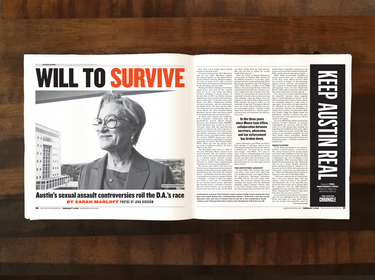
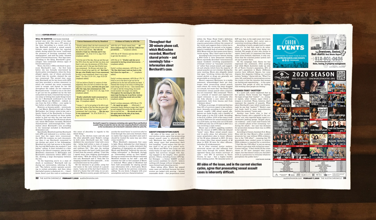
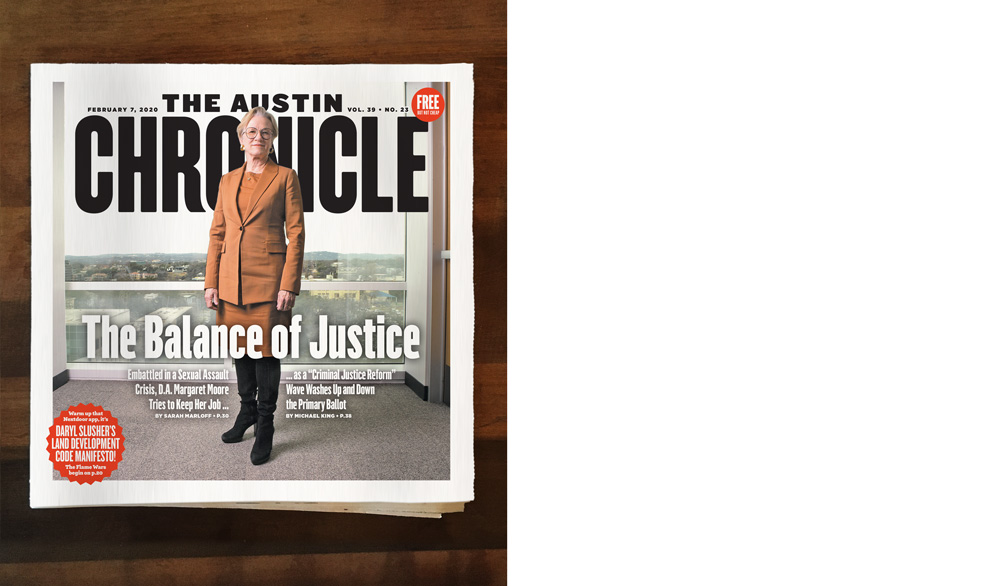
When the redesign of The Austin Chronicle, launched in January 2020, was in its conception, feature layout was a major focus. The Chronicle had been notoriously jam-packed with copy, and graphic design was secondary to maximum information. The rules had always been fast and loose; a grid is made to be broken, make the leading/kerning/point size just a bit tighter to allow 15 more words to be stuffed in, make a photo one-column wide to make room for copy.
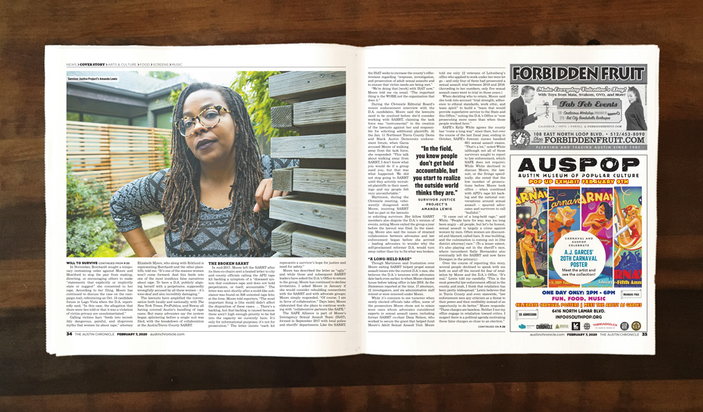
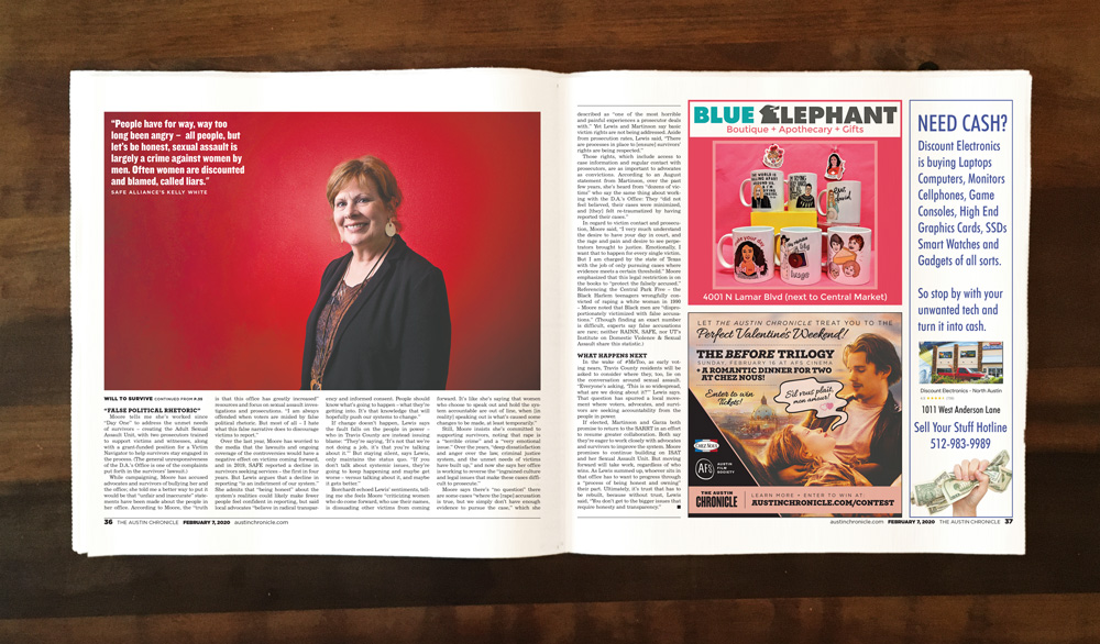
A layout like this one, in the second issue of the redesign, was unheard of until that point: 4-column wide photos to balance out dense copy, a chance for the words to breathe a bit, to give the reader a reason not to just blow past fields of gray type.
Since the redesign was launched, the idea of balancing out image to copy has been mostly wrangled back to an old-school approach to newspapering, but nice, absorbable layouts still occassionaly get in there, and invite the reader to stick around.

